METROLINK
simplifying trip planning and ticketing for Metrolink riders to Increase app engagement
Metrolink’s mobile app is a key way riders buy tickets, but many found it confusing, limited, and frustrating to use. Important tasks like choosing the right ticket, finding routes, and tracking trains weren’t clear or fully supported, leading to wasted time, mistakes, and lower app usage.
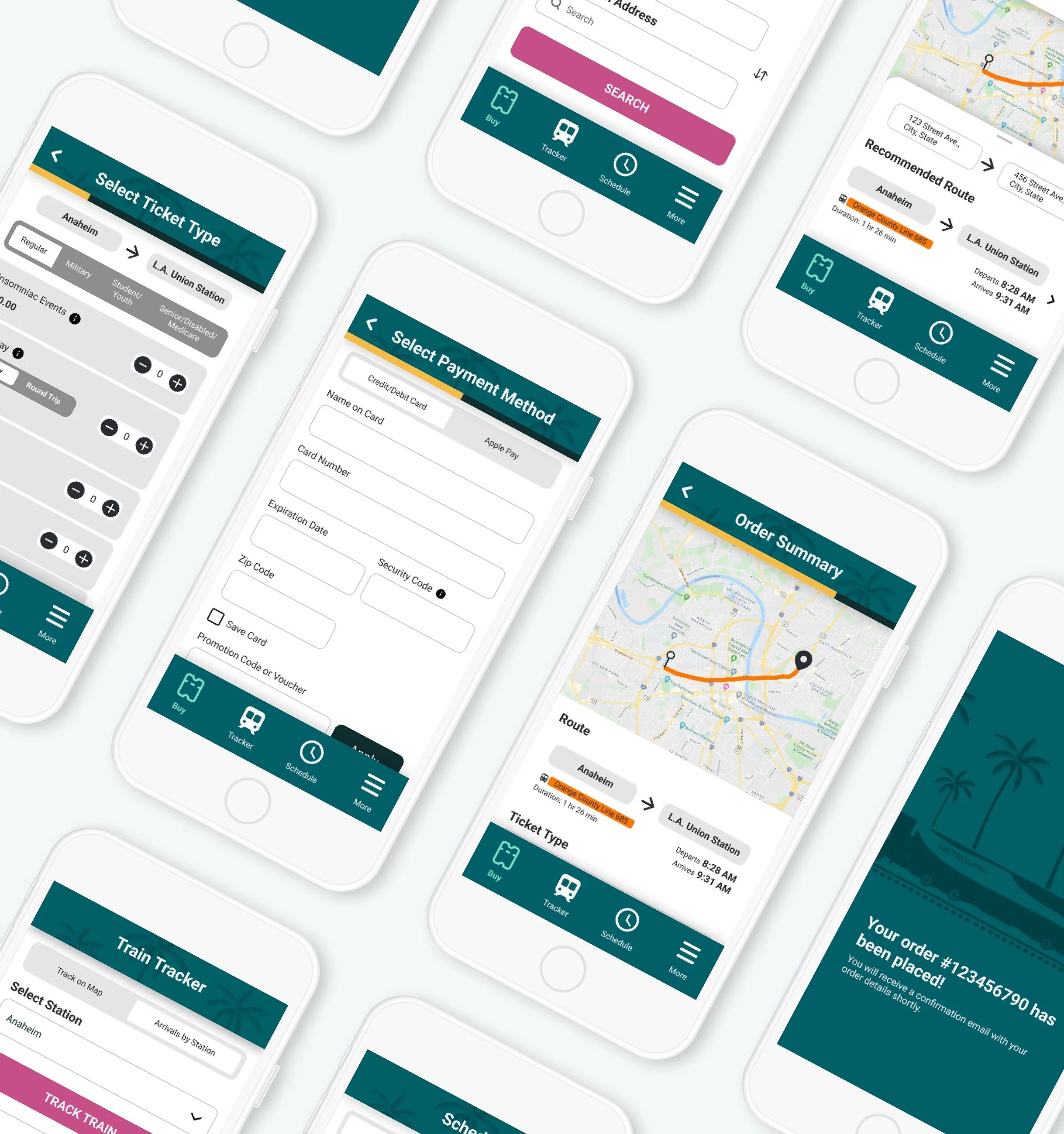
As the sole designer, I led a 3-month redesign focused on making the app more useful beyond just ticket purchasing. I clarified complex ticket information, simplified the buying process, and introduced key features like route recommendations, train tracking, and schedule checking, designed to help users plan their trips with confidence.
After two rounds of user testing and iteration, user satisfaction significantly improved. The likelihood of users returning to the app increased by 37%, and overall experience ratings became more positive. This project demonstrated how clearer content, better structure, and the right feature set can turn a frustrating tool into one riders actually want to use.
Team
Solo UX/UI Designer
Tools
Figma, Google Forms, Zoom
Time
3 Months
Several surveyed app users were disappointed in the how limited the app was
With its primary focus on ticket purchasing, and an overwhelming number of users were angry with how unclear ticketing information was, resulting in a waste of their time and money.
Method
App Reviews
Google Surveys
Count
17 Participants
Source
Facebook, Reddit
More than half of all Metrolink purchases are done made through the mobile app, yet only 49% of riders say they use it.
Overall, based on their experience with the app:
63% of users expressed that they were likely or very likely to use the app again
79% of users were likely or very likely to ride with Metrolink again

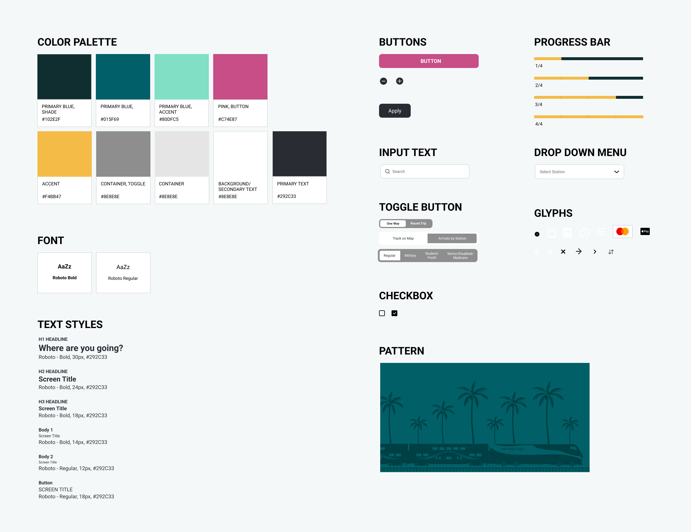
Metrolink's current UI design is simple and functional but has room for improvement in its heuristics, accessibility, and cognitive load.
I maintained the current color palette and components but added a few colors for the containers and accents.

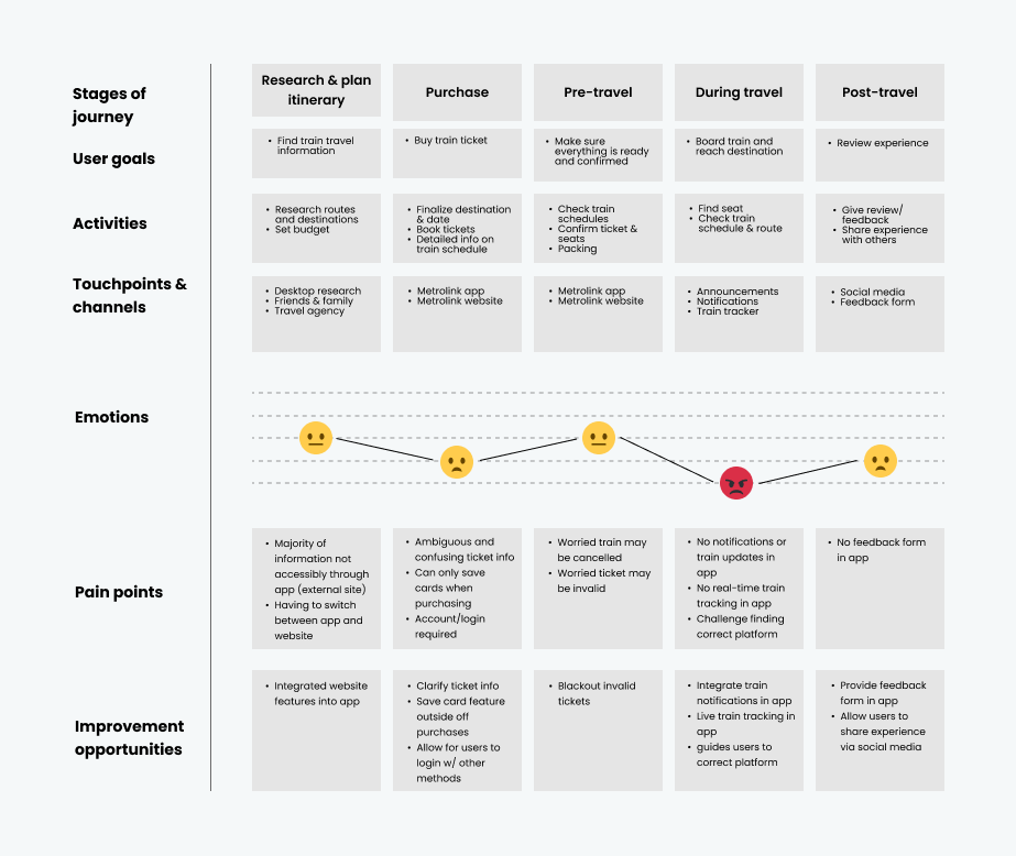
Delving deeper into user goals and pain points
User Journey
Based on user interviews, users had trouble with the ticket purchase, during-travel, and post-travel stages of their trip. In these stages, we identified user emotions, pain points, and areas of opportunity for improvement.
User Stories

Basing goals on user, business, and product needs
User: Select the right ticket to purchase, track train location, and check train schedule
Business: Increase ridership and revenue
Product: Expand app capabilities
Ideating with constraints
Feature Prioritization
For this project, my constraints were a short timeframe, a small budget, and limited access to certain technology. Based on these constraints, I prioritized each feature under Must Haves, Should Haves, and Could Haves.

Wireframing

Clarifying existing content for users
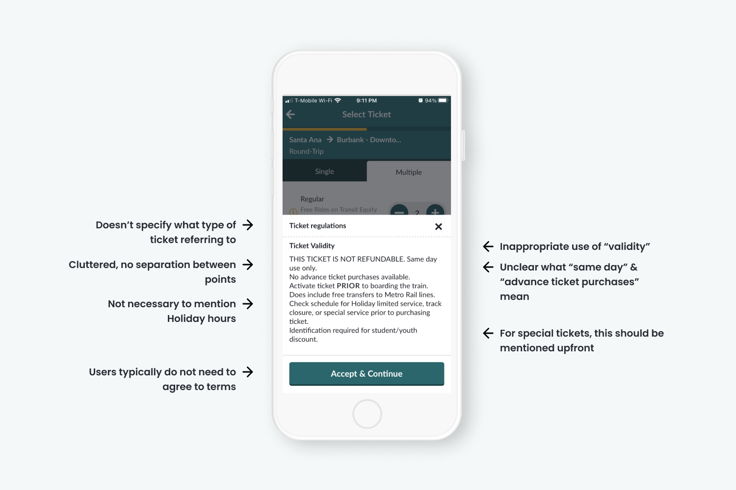
Metrolink relies on piling their ticket information (disclaimers, instructions, and use instances) all into a single tooltip. Because of this, users often overlook this information and find it to be overwhelming to remember. In response, I simplified and reallocated the tooltip information to make it easier for users to understand how to use their ticket.
Old UI
New UI

Introducing new features to users
Get Recommended Route From Origin & Destination Input
Metrolink’s ticket selection process relies on users to know which stations they want their train to depart and arrive at. This adds anxiety and additional effort to their experience as users are forced to exit the Metrolink app and use another app (e.g. Google Maps) to find the correct stations. In response, I designed a route recommendation feature that chooses the stations based on the user inputted origin address and destination address and visually displays the entire route on a map.

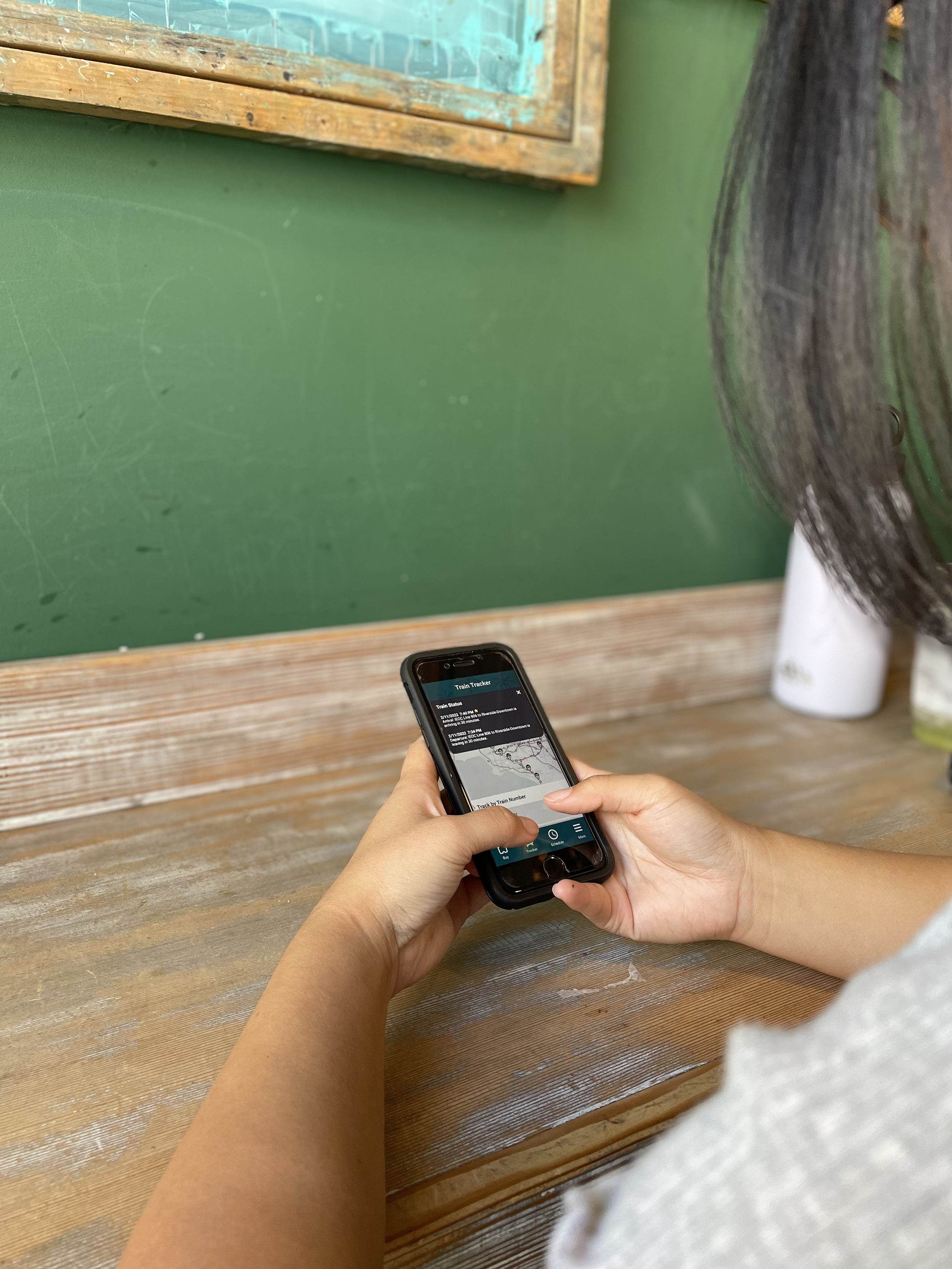
Track Where Your Train Is
Another important part of the user’s journey is tracking their train location and status so they can plan their day better. Considering how vital it was, users were disappointed that this feature wasn’t integrated into the app. Therefore, I designed a train tracker feature that allows users to track their train via map and by selecting a station.
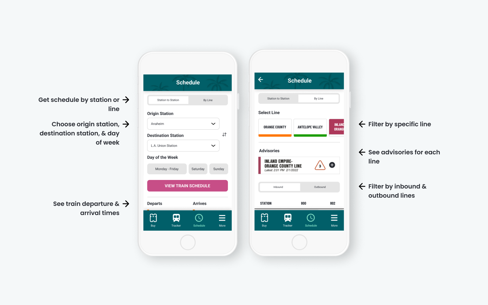
Check Schedules for Updates
Equally important as the train tracker was the train schedule. Users wanted to be able to check on their train schedule ahead of time and be informed of any changes to their route.
What did users think?
Determined to make the new features work the way users wanted, we conducted two rounds of user testing with iterations based on feedback.
User Testing 1: Participants liked the new features but had some issues with features looking too similar and not being able to correct their errors.
Based on the usability testing, I decided to work on the following design changes:
Redesign the "Schedule" feature to be more distinct
Only show features that can be interacted with
Add a way for users to change their route after having selected one
Add visuals and color design

"The map in the tracker is really cool and informative."
"I like the option to track where the train is."
"I was confused with 'Schedule'. The first page looks like I'm about to purchase a ticket. I think it'd be clearer if there was some text above to explain that the page is meant to check the schedules."
"There needs to be a way for users to go back and change their route if they need to."
User Testing 2: Participants liked simplicity of the visual design and had issues with some interactions not being obvious enough.
According to feedback,
100% of users were likely or very likely to use the app again (37% increase)
80% of users were likely or very likely to use Metrolink again (1% increase)
Based on these metrics, we finalized our design and predicted that the new mobile app design will increase user retention and ridership.
“The buying experience was really smooth!”
“Straightforward process - Didn't feel complicated to find a train route and purchase a ticket”
"The simplicity of the design. It is very straightforward and easy to use but also looks very good. Love the colors you used."
Final Product
Style Guide
Prototype
Reflecting on my work and the impact of good design
Redesigning Metrolink's mobile app was a fun and insightful experience. Getting to explore users' pain points, motivations, and goals showed complexity for why customers use a product or service and how vital it is for a company's success to focus on good design. In addition, only having a few months to deliver this concept also taught me the ability to work smart and quickly.
Looking back, I would:
Increase the number of participants in the usability testing so we have a more accurate depiction of the app’s users and their feedback on the app
Explore more complex UI designs like animation and motion design to make the experience more delightful