GROW PROGRESS
From demo to decision: redesigning the insights dashboard for our flagship product
Transformed a high-stakes dashboard that was struggling to serve both sales prospects and existing clients into a flexible, self-serve experience. Designed for a spectrum of users, from first-time evaluators to power users to executive stakeholders while balancing usability, analytical depth, and storytelling.
Team
1 Senior Product Manager
1 Product Designer
4 Software Developers
2 Commercial Sales
1 Data Scientist
Tools
JSON
Figma
Claude
Problem
The insights dashboard was the single most important touchpoint in the commercial client journey: it was both the sales demo artifact and the primary way clients consumed test results. But it was being asked to serve three very different audiences, poorly.
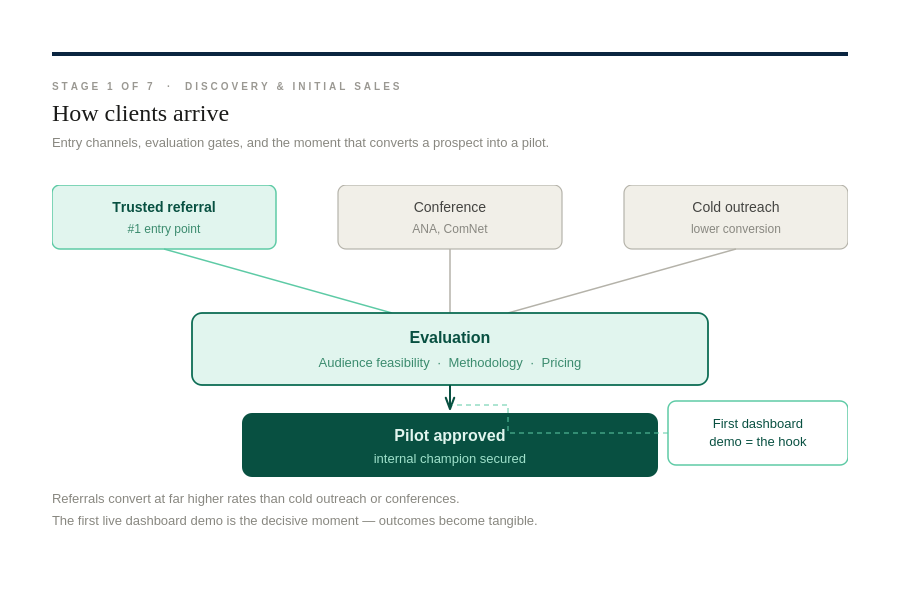
For sales prospects, the first dashboard demo was the "moment of truth" but the dashboard was built for people who already understood the methodology, not for someone evaluating whether to pilot.
Sales reps were screen-sharing past study dashboards on video calls to make the platform tangible. But the demo experience required heavy hand-holding where reps had to narrate what every color, number, and tab meant.
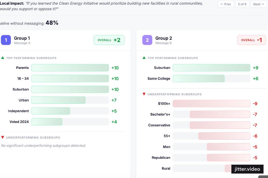
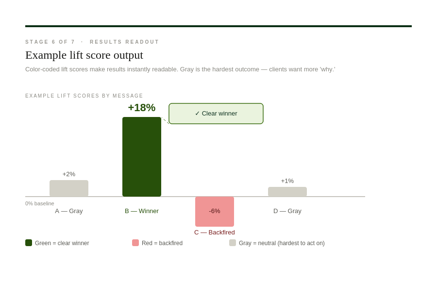
For existing clients, there were recurring friction points around interpreting results: "What does gray mean?" was the top friction at the results readout stage.
Neutral results were the hardest to act on. Clients wanted more "why" behind the data, and they were repackaging dashboard data into their own decks under tight deadlines (same-day turnarounds in some cases).
The export and report-building flows existed but weren't intuitive enough for self-serve.
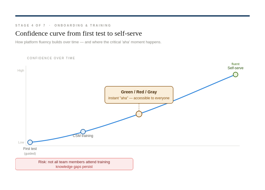
For onboarding clients, not everyone attended training, advanced features required workarounds, and knowledge gaps persisted.
The platform was described as "really user friendly once you get kind of first start hunting around,” a polite way of saying there's a discovery curve.
Users
What appeared to be a mismatch between sales prospects and existing clients was actually a broader challenge: the dashboard needed to support five distinct user roles, from first-time evaluators to hands-on analysts to executive decision-makers, each with different expectations for clarity, depth, speed, and credibility.
The Internal Champion
They've found GP, they believe in it, but they need to sell it internally. Their biggest concern is credibility: can this reach my niche audience, and will the results convince my leadership? They're evaluating methodology during the demo and need the dashboard to tell a clear story they can bring back to stakeholders.
The Agency Partner
Using GP on behalf of their clients, often across multiple accounts. They need to quickly pull results into their own decks, understand what's working across campaigns, and look credible doing it. Speed and export matter. They're evaluating GP as a tool they'd integrate into their workflow.
The Executive Stakeholder
They're not in the platform daily. They see results in a readout meeting or a repackaged deck. They ask hard questions like "you're telling me how to convince people already convinced," and need the data to clearly justify continued investment. They care about sample credibility and whether the methodology holds up to scrutiny.
The Hands-On Strategist
Deep in the weeds on messaging, word-smithing success questions, debating freedom vs. democracy framing. They care about nuance: subgroups, opposition testing, what gray means. They're the ones waking up at 6:30 to check results. They need the dashboard to support, not only top-line scores, but analysis depth.
The New Team Member
Curious, eager, but missed the training. They're poking around the platform for the first time without a CSM walkthrough. If the dashboard doesn't make sense on its own, they stall or wait for someone to explain it. They're the litmus test for self-serve usability.
Opportunity
Redesign the dashboard to reduce friction, support multiple priorities, and unlock adoption across the client journey.
The dashboard presented an opportunity to address long-standing friction points across the client journey. First-time users needed to explore results independently, analysts needed deeper insight capabilities, decision-makers required trustworthy data, and workflow-focused users needed faster export and reporting.
This challenge highlighted the potential to balance multiple competing needs in a single platform, creating a more flexible, usable, and interpretable dashboard without overwhelming any single user role.
Solution
Updated features and flows to prioritize critical user needs, balancing clarity, analytical depth, and flexibility without overwhelming any role.
To address the opportunity, the dashboard was redesigned to prioritize the critical needs of each user role while keeping the interface clean and intuitive:
Designed clear visual storytelling and methodology explanations so champions could confidently bring results back to their leadership.
Optimized layout for speed and credibility, so agencies could integrate GP seamlessly into their workflow.
Enhanced depth of analysis by enabling subgroup comparisons, opposition testing, and detailed breakdowns.
Streamlined export and report-building flows, allowing partners to quickly pull results into client decks and evaluate multiple campaigns efficiently.
Improved onboarding cues and progressive disclosure, making the dashboard more intuitive for first-time users who missed formal training.
Added contextual guidance for interpreting “gray” or neutral results, supporting nuanced decision-making without overwhelming the interface.
Highlighted key takeaways, sample credibility, and methodology notes for executives who interact with results occasionally.
Ensured the interface communicated meaning without requiring manual walkthrough, enabling self-serve exploration.
Designed summary views that justified continued investment and supported confident decision-making in readout meetings.
The redesign balanced flexibility and focus, allowing a single dashboard to serve multiple roles without overwhelming any one user. By aligning features with priority needs, it reduced friction, supported adoption, and enabled clients to get more value from the platform independently.
Impact
Established the foundation for a scalable, high-value dashboard across users and workflows
Set the foundation for adoption: Redesigned the dashboard structure and flows to support multiple user roles, enabling first-time users and clients to eventually interact independently.
Prepared for scalable workflows: Streamlined reporting and export ideas so agency partners could more efficiently share insights once implemented.
Increased clarity and credibility: Defined how results could be communicated to executives and internal champions, helping build confidence in data-driven decisions.
Enabled deeper analysis: Created structures and UI patterns to support nuanced exploration by analysts and strategists.
Established a roadmap for growth: Positioned the dashboard to handle multiple roles without overwhelming users, setting the stage for future self-serve adoption.